 Bundesliga


 Chilean Primera Division


 Dutch Eredivisie

 EFL Championship

 J1 League


 La Liga


 Liga MX


 Liga Profesional

 MLS
MLS


 Premier League


 Primeira Liga
 Saudi Professional League
 Scottish Premiership


 Serie A


 Ligue 1


Introduction
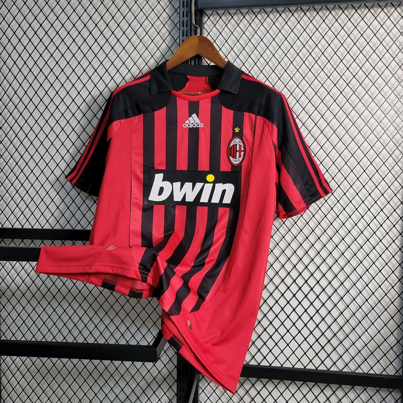
Steeped in the tradition and aesthetics of football, AC Milan remains a name that evokes reverence among sporting enthusiasts across the globe—the 2009-10 season marked a seminal moment in the club’s sartorial history, as they unveiled not just one but two different away kits. These were more than mere sportswear – they embodied AC Milan’s ethos, reflecting the determination, class, and relentless pursuit of excellence the club is renowned for.
Taking a New Direction: Breaking Away from Tradition
In the dynamic and ever-evolving world of football, the 2009-10 season was a pivotal period for AC Milan. The club demonstrated a bold willingness to break the mold, departing from the conventional practice of issuing a single away kit. Instead, they embarked on a creative journey to introduce two unique designs. These creations, forged in a strategic partnership with sportswear titan Adidas, combined cutting-edge sports apparel technology with a distinct stylistic flair. Each design acted as a canvas, painting a different facet of the club’s rich and diverse identity. This ambitious endeavor underscored AC Milan’s commitment to advancing the club while maintaining its respect for its storied history.
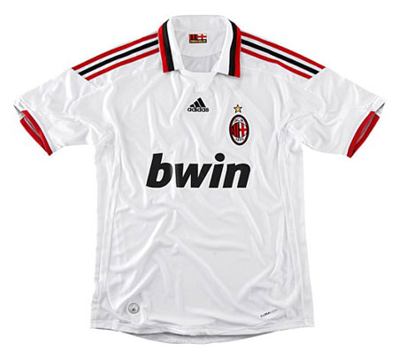
White Jersey: A Classic Tribute
The white jersey was more than just a piece of clothing – it was a powerful symbol that paid homage to the bygone era of football. This garment expertly blended old-school elegance with state-of-the-art sportswear technology. Its most distinguishing feature was a sophisticated flip collar, a design element that harked back to the classic styles of football apparel. This feature exuded a sense of nostalgia, a reminder of the club’s longstanding history and tradition. The collar was tastefully embellished with the traditional red and black stripes of AC Milan, serving as a salute to the club’s rich heritage. These colors, pulsating with intensity, served as an enduring symbol of the passion that fuels the team and its fans, expressing a vivid connection to the past
while looking toward the future.
Black Jersey: A Glimpse into the Future
In stark contrast to the white jersey, the black jersey embraced the spirit of modernity and the future. It opted for a modernist design approach with a sleek round neck style, presenting a streamlined and contemporary aesthetic that was striking in its simplicity. The deep black color was a potent representation of AC Milan’s strength, resilience, and unyielding authority that the club commands on and off the pitch. This jersey was a tangible demonstration of AC Milan’s belief in evolution and progress. While the club respects and cherishes its history, it is not confined. Instead, AC Milan uses its storied past as a foundation to build, evolve, and embrace the constant flux of change in football.
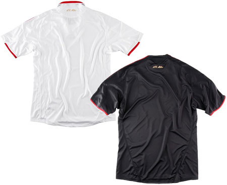
Unifying Elements: Emblems of Pride
While both jerseys diverged in their designs, they were intrinsically linked by shared elements that bespoke AC Milan’s deep-seated pride and prestige. Each jersey bore the golden embroidered lettering of AC Milan at the back of the collar, a feature that was subtle in its placement but substantial in its impact. This element was a constant reminder of the club’s name and illustrious history, casting a golden glow that reflected the club’s lustrous achievements. Nestled within the collar, hidden from the public eye but close to the heart of the wearer, was the rallying cry ‘FORZA MILAN’. This phrase, steeped in emotion and significance for the club and its fans, translates to ‘Go Milan.’ It is more than just a catchphrase – it is a battle cry that captures the spirit of unity, determination, and resilience that epitomizes AC Milan. This phrase resonates with the club’s heartbeat, pulsing with the passion and energy that drives this esteemed institution.
Conclusion: Symbolizing AC Milan’s Spirit
AC Milan’s 2009-10 away jerseys were a harmonious blend of tradition and evolution. The white and black jerseys, distinct in design yet unified in spirit, symbolized the club’s diverse identity and the unity that binds its players and fans. They were a testament to the passionate energy that AC Milan carries into every game, reflecting the team’s readiness to face any challenge. These jerseys were not just high-performance sportswear but also powerful symbols of the essence of AC Milan, weaving together threads of the club’s heritage and its forward-looking ethos. This blend of the old and the new, the classic and the contemporary, made the 2009-10 away jerseys a fair representation of AC Milan’s culture and identity, forging a deeper connection between the club and its fans.